Overview
I joined Leia with no shared design system. The team worked in Sketch with inconsistent patterns across products. I led the migration to Figma and established the foundational system: typography, colors, iconography, component states. Components were designed for lightfield 3D display constraints (UI positioning, readability at depth). The system rolled out across LeiaFlix, LeiaPlayer, LeiaCam, Leia Appstore, and 6 more apps.
Problem
When I joined, the design team worked in Sketch with no shared library. Each product had its own patterns. Leia Appstore looked different from LeiaPlayer: different button styles, icon sizing, typography weights. The team was small and moving fast, and without a system, every new screen meant reinventing decisions that should have been solved once.
The lightfield display added constraints most design systems never deal with. Buttons and controls needed higher contrast ratios to stay readable when rendered in 3D. Certain color combinations caused eye strain. UI elements had to work at specific depth planes, and background shades needed to signal hierarchy in ways that made sense alongside 3D content. Standard Material Design patterns got us partway there, but we had to adapt them for hardware that didn't exist when those guidelines were written.
Solution
From Sketch to Figma
I led the transition from Sketch to Figma, moving from scattered symbols to a structured component library. I set up the team library, established naming conventions, and trained the team on the new workflow. I also recorded presentations for developers on how to use Figma, which became reference materials for onboarding.
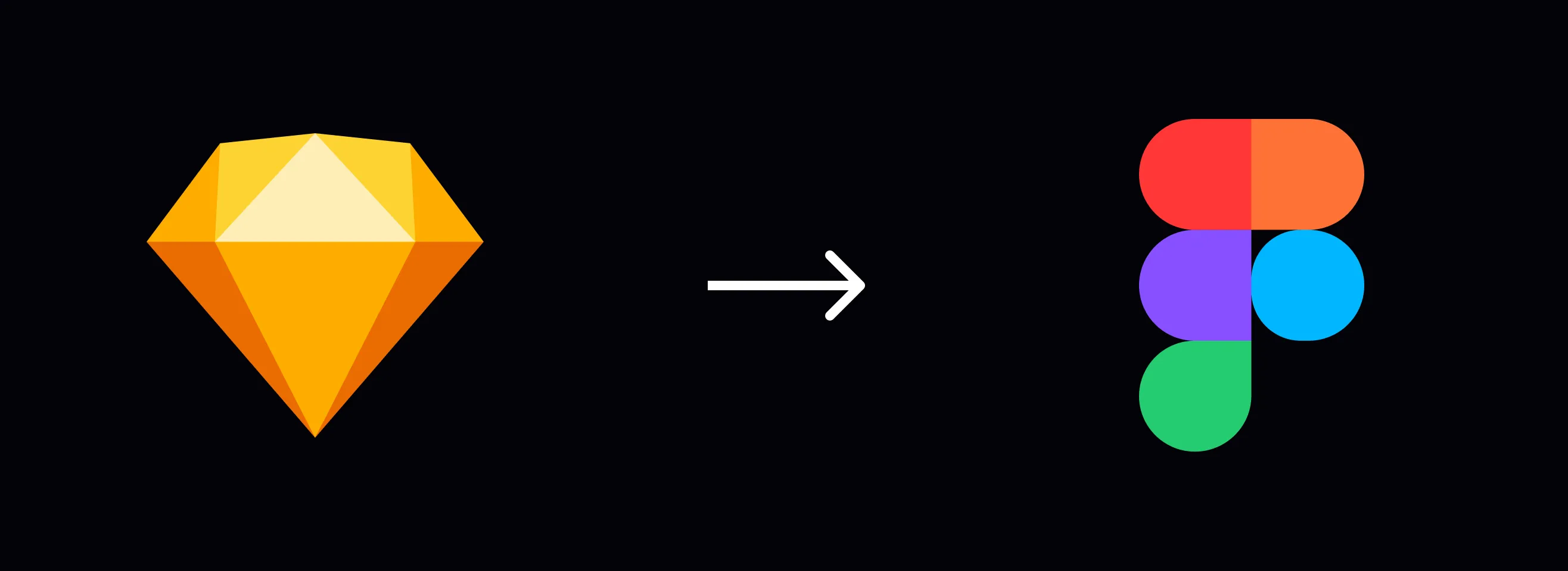
Migrating from scattered Sketch files to a structured Figma library
Built foundational styles
I created the initial core system: typography scale, color tokens, spacing, and icon library. For colors, I worked with the optical engineering team to identify which hues caused discomfort on the lightfield display and built that into the palette constraints. We established a depth-based layering approach where background shades signaled hierarchy, giving designers a clear model for building interfaces that worked alongside 3D content.
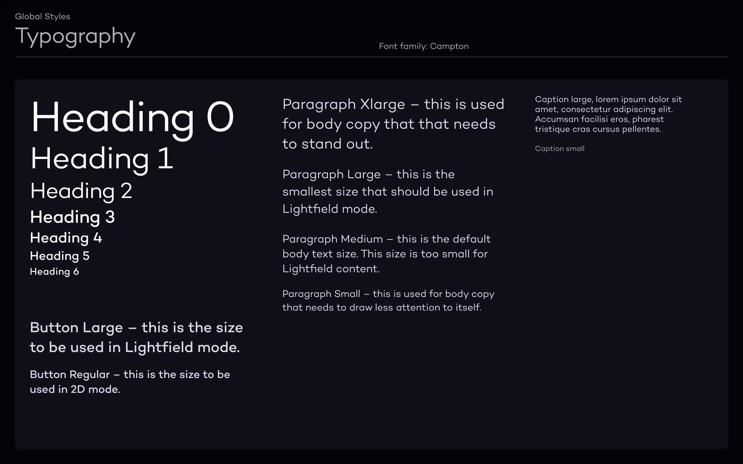
Typography scale designed for readability on lightfield displays
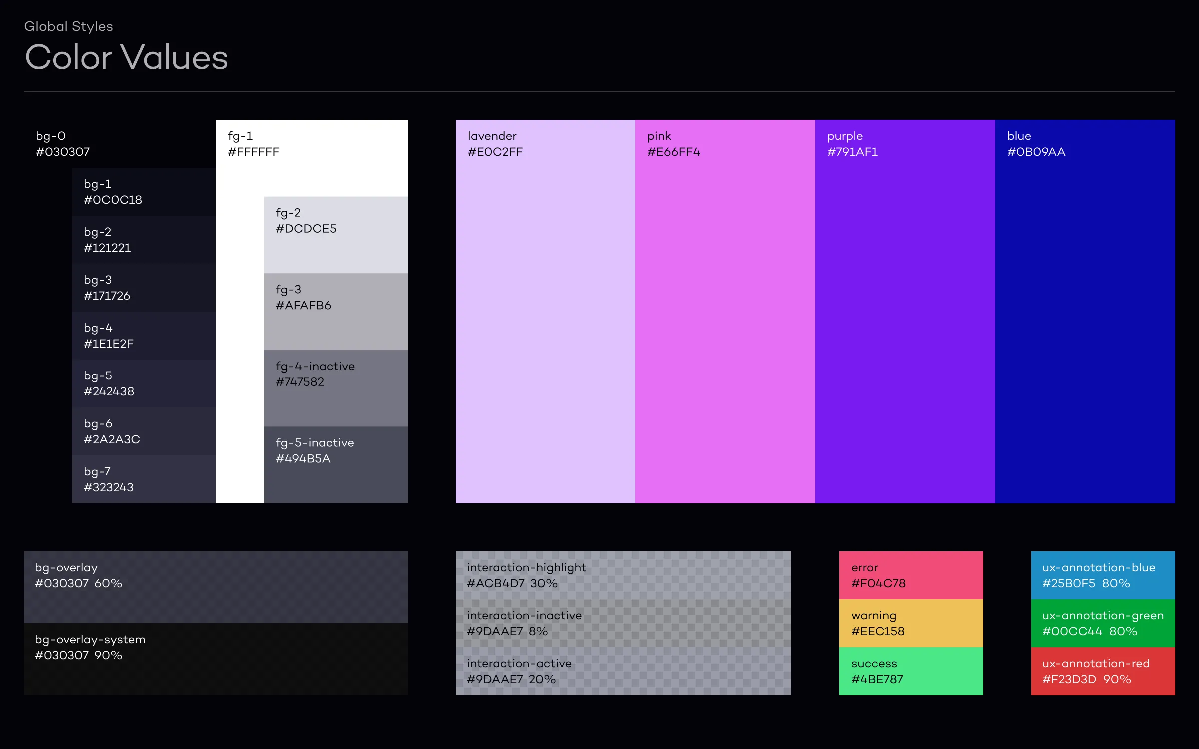
Color tokens built around display-safe hues
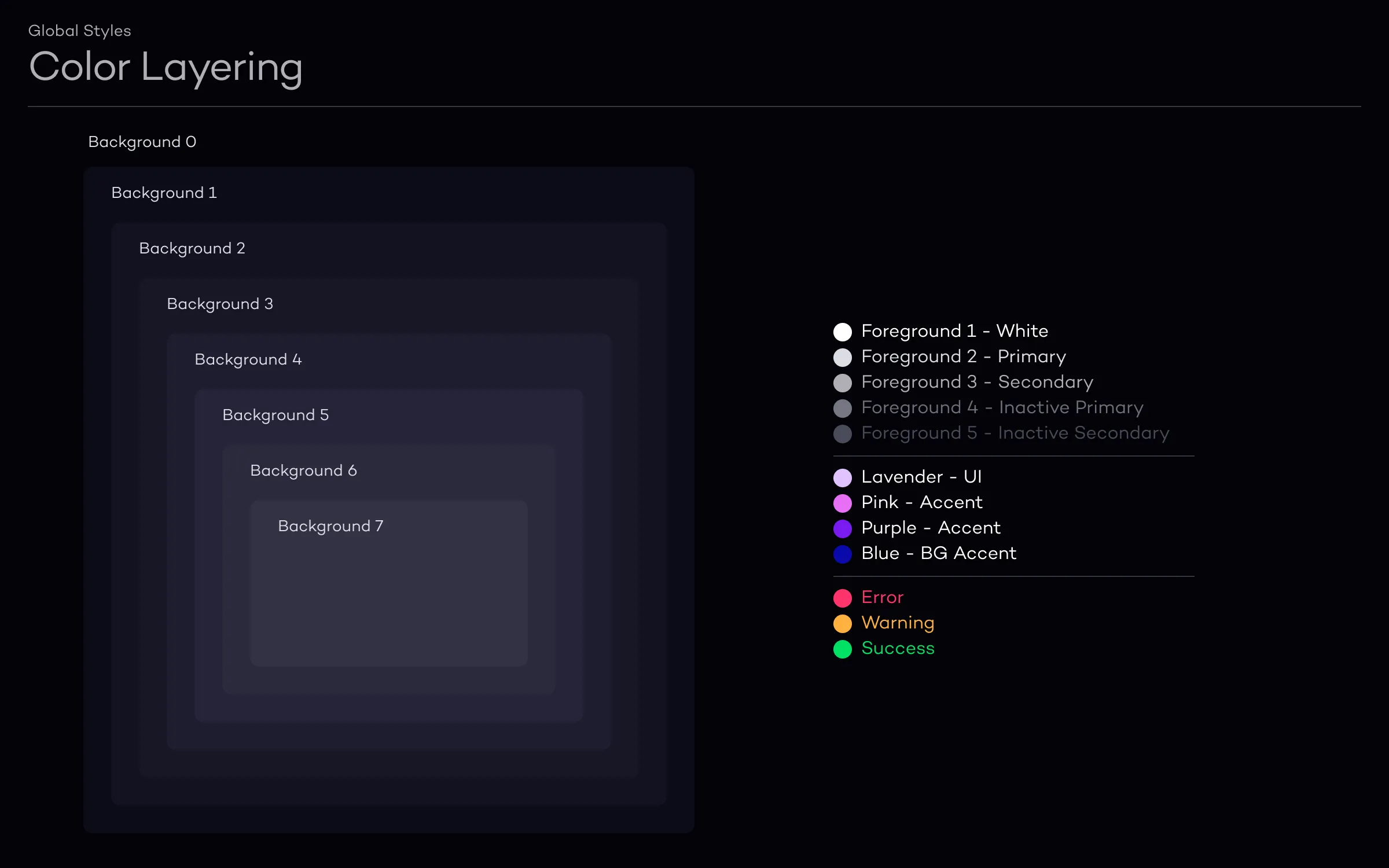
Depth-based layering approach for UI alongside 3D content
Component system
Many of the system's components started as solutions I built for LeiaFlix, the movie rental app. The video player, media cards, and navigation patterns I designed there became the foundation that other apps adopted. We organized the library using Atomic Design: atoms (icons, tokens), molecules (buttons, inputs), and organisms (media players, navigation). This structure gave designers flexibility to compose new screens while keeping things consistent across products.
The video player component alone had 12+ states across streaming, buffering, and 2D/3D modes.
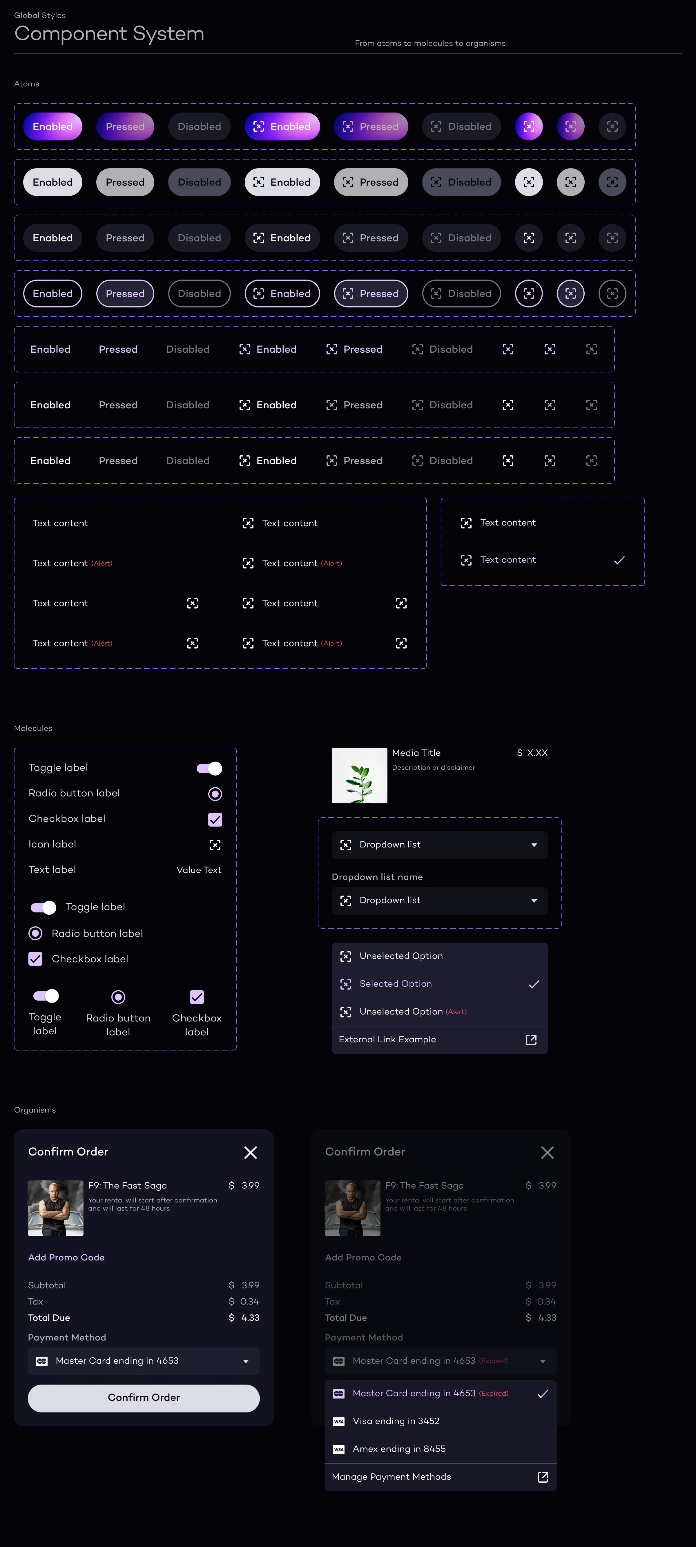
Building blocks at three scales, from icons to full media players
Cross-product rollout
When a visual designer joined, the system work became a constant collaboration. We took a phased approach, rolling out to each product team and adapting the system based on how they were actually using it. I stayed hands-on with components and icons while also advising on priorities and coordinating across teams. We ran regular sessions with engineering to keep design and code in sync, and presented to stakeholders to maintain alignment across product, engineering, and leadership.
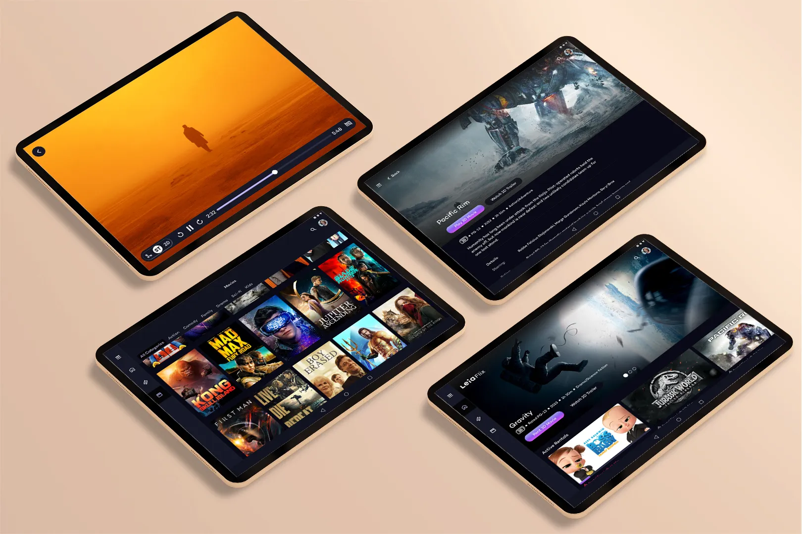
The system shipped across 10+ apps for the Lume Pad 2 launch
Outcome
The system shipped with the Lume Pad 2 launch, supporting 10+ apps across the product ecosystem. Around 40 people adopted the system, and design-to-development time dropped by roughly 75% as teams stopped rebuilding the same components. The display constraint work (color comfort, depth-based layering) became shared knowledge that the team could build on after I left.
What I'd change
I'd document the display constraints earlier. The knowledge about which colors caused discomfort and which depth planes worked best lived in my head and in Slack threads. By the time I formalized it, I'd already made decisions that newer team members couldn't trace back. Better documentation from day one would have made handoff smoother.