Overview
Leia's Lumepad 2 was a glasses-free 3D tablet that needed a mainstream content experience. I designed LeiaFlix, the movie rental app, from scratch, including the catalog, streaming player, and content partnership integration with Warner Bros and Universal. After launch, the browser-based checkout was losing 74% of users at the payment step. I evaluated payment vendors, advocated for Stripe, and designed the native in-app payment flow. Drop-off went from 74% to 54%.
Problem
Leia built a tablet with a glasses-free 3D display powered by light field technology. The device already had apps for enthusiasts, but watching a 3D movie required sourcing files, understanding 3D formats, and converting content manually. When Leia launched the Lumepad 2 with improved display comfort, we wanted to make this easier not only for existing users but also for new adopters: rent a movie, tap play, watch it in 3D.
I led the design of LeiaFlix, our movie rental app, from scratch. The hardware added constraints most streaming apps never deal with. 3D light field files are massive, and when resolution dropped during playback, the 3D effect broke down in ways that caused visual discomfort. The problem wasn't just "build a streaming app." It was build one where the technical floor for acceptable quality was higher than anything on a normal screen.
We launched with free rental credits so users could experience the service immediately. That worked for demonstrating the product, but it also meant the payment flow wasn't tested at real volume. Checkout lived in a browser that interrupted the in-app experience and didn't save payment methods for further rentals. Once users burned through their credits and real transactions started, the friction became visible: 74% dropped off at the browser handoff.
Solution
New device, familiar software
We tested different layout approaches for browsing the catalog. The version closest to familiar streaming platform patterns consistently scored highest. That confirmed the direction: for a device this unfamiliar, the software needed to feel instantly recognizable, even if we gave it our own treatment.
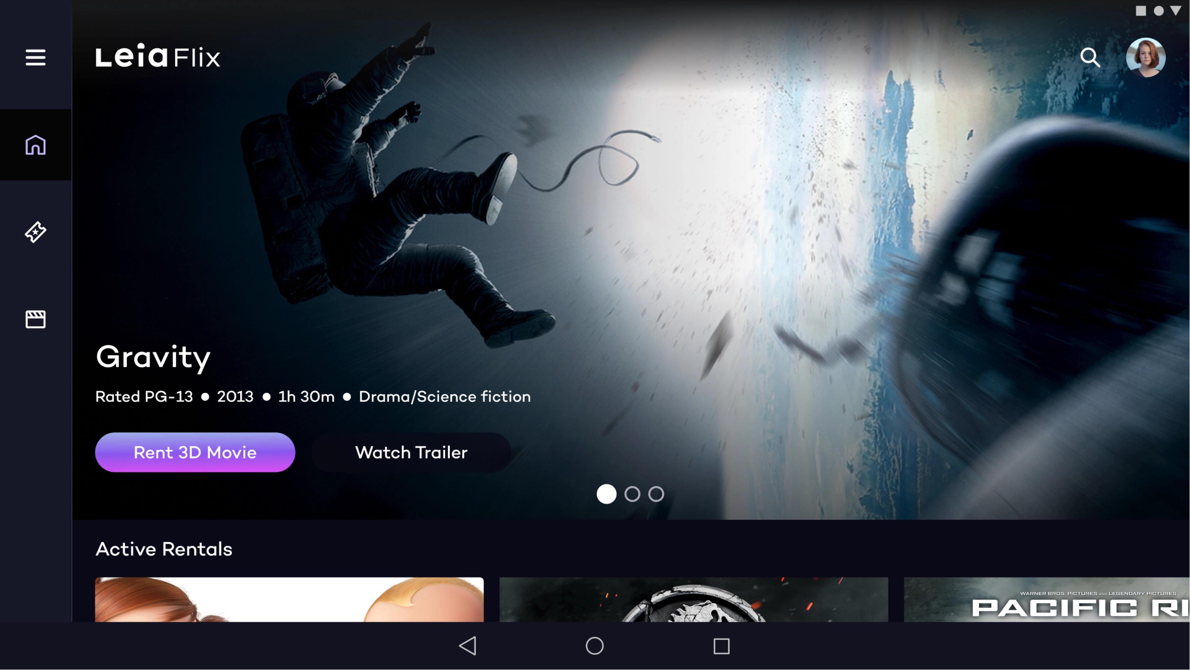
LeiaFlix home page showing featured movies first before the catalog
Content came from Warner Bros and Universal. Their asset pipelines gave us hero images with gradients pre-applied for text overlays, standardized movie tiles, and trailer videos (though none were in 3D, which was a disappointment). We pulled metadata from their feeds but had to filter it down to what actually mattered in our UI. One detail that earned its place: 3D format tags. Power users cared which format a movie used before they committed to renting it, so we surfaced that in the movie profile.
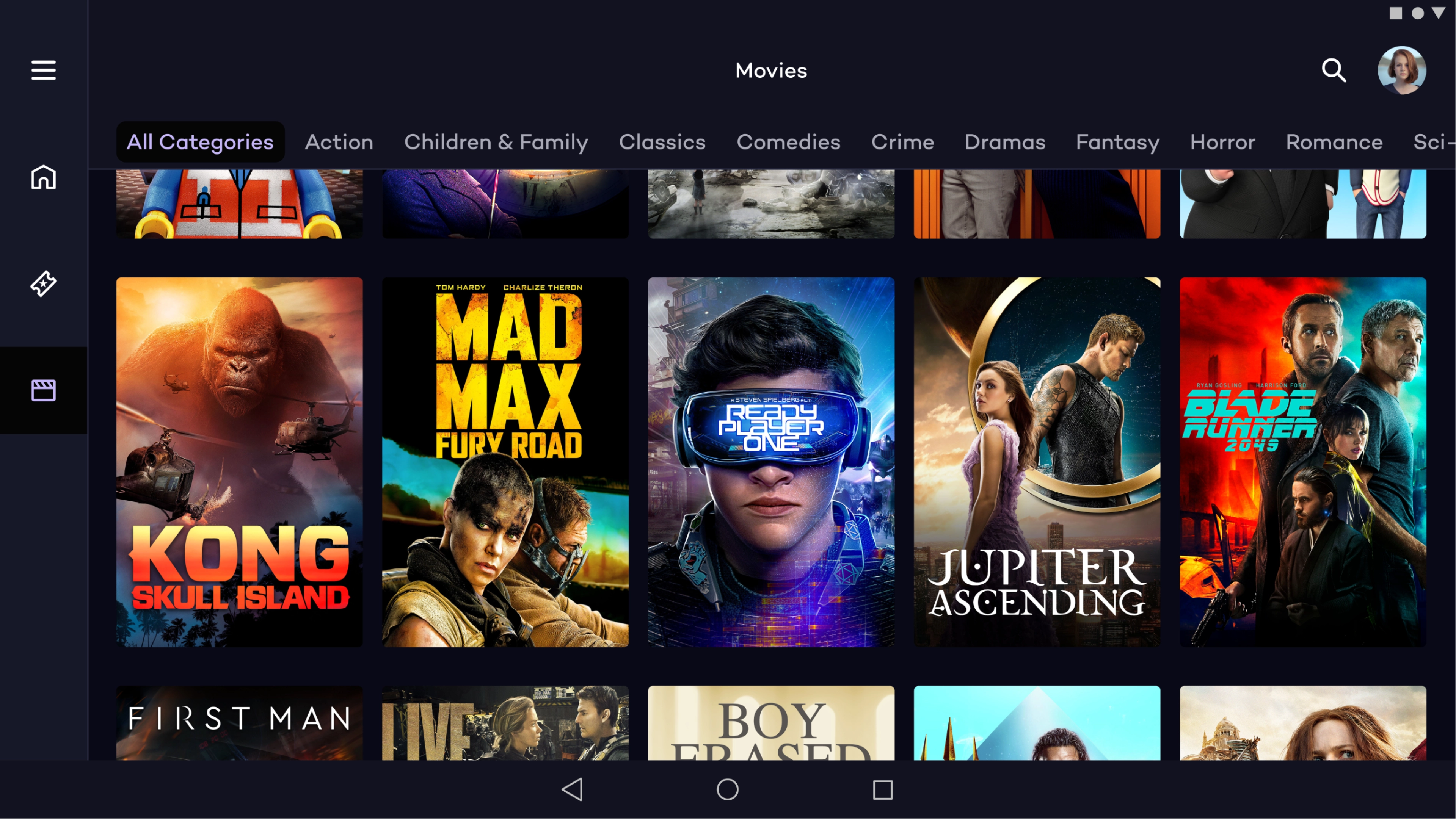
Movies section showing a grid of movie with the option to filter by category
When buffering means discomfort, not just waiting
For streaming quality, I partnered with the optical engineering team to address latency and file size. Early streaming tests were rough enough that the engineers built a system to cache the full file on-device, hidden from the user to satisfy licensing restrictions. That solved the core quality issue. For moments when resolution still dipped during streaming, I designed a buffering modal that gave users the option to switch to 2D while the stream recovered. This sat on top of a persistent 2D/3D toggle in the player controls, so users always had both a reactive escape and a proactive choice.
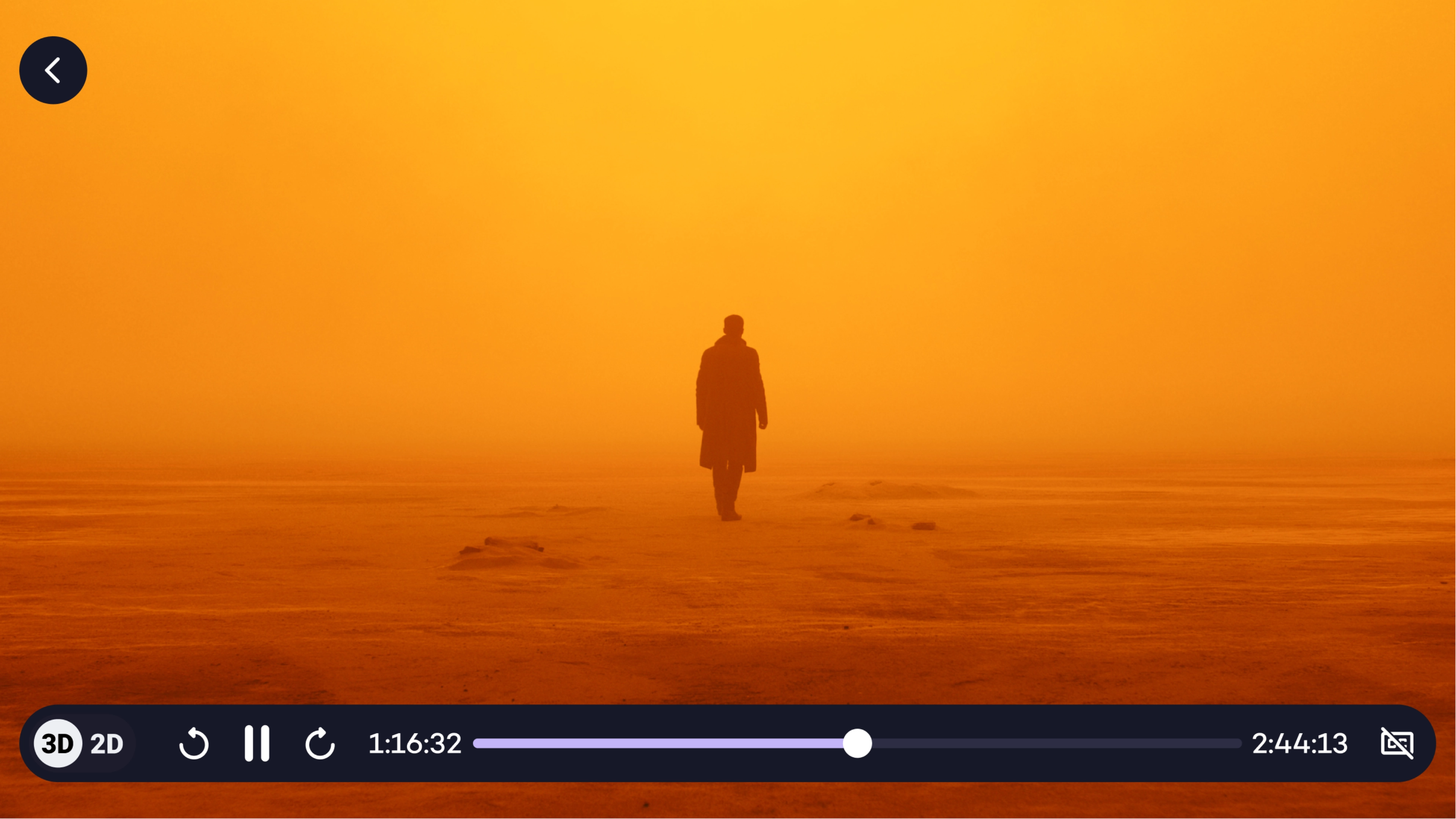
Player controls showing the 2D/3D toggle
Free credits hid the payment problem until they ran out
I worked with our PM to negotiate 3 free rental credits for new users. The studios weren't considering this initially. I built out the scenarios showing how the experience would flow from free rentals, to showing remaining credits, to the transition into paid. That framing helped convince the partners, and it removed the biggest barrier to first-time engagement.
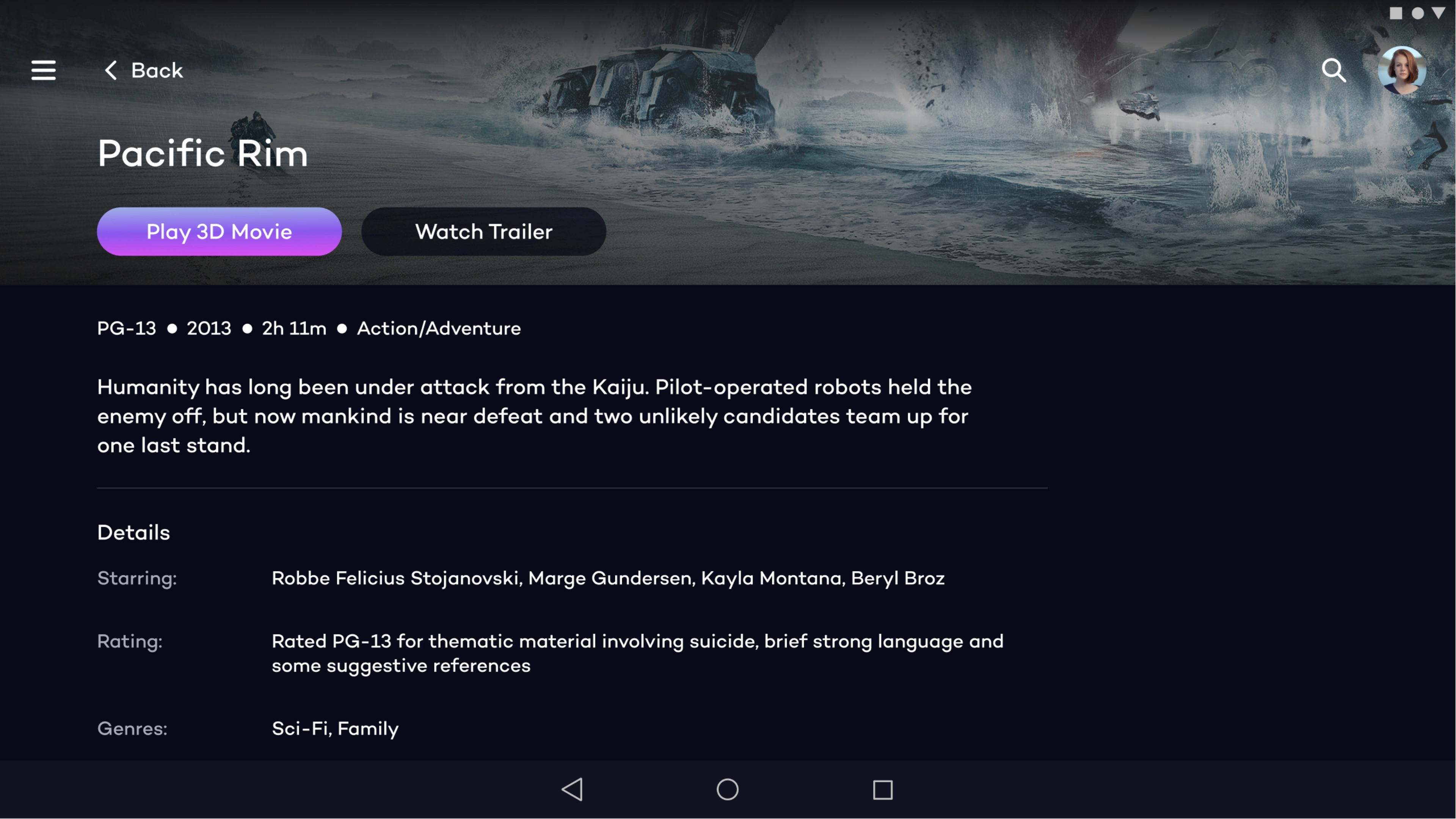
Movie profile page showing format tags and hero image treatment
Once free credits ran out and real transactions started, the 74% drop-off confirmed the browser checkout was a bottleneck. I evaluated Stripe, Braintree, Adyen, PayPal Commerce Platform, and Square. Stripe won on three factors: developer experience that would let our small team move fast, multi-market payment support for international users, and predictable per-transaction pricing that made sense for low-cost rentals. Adyen's enterprise onboarding alone would have cost us weeks.
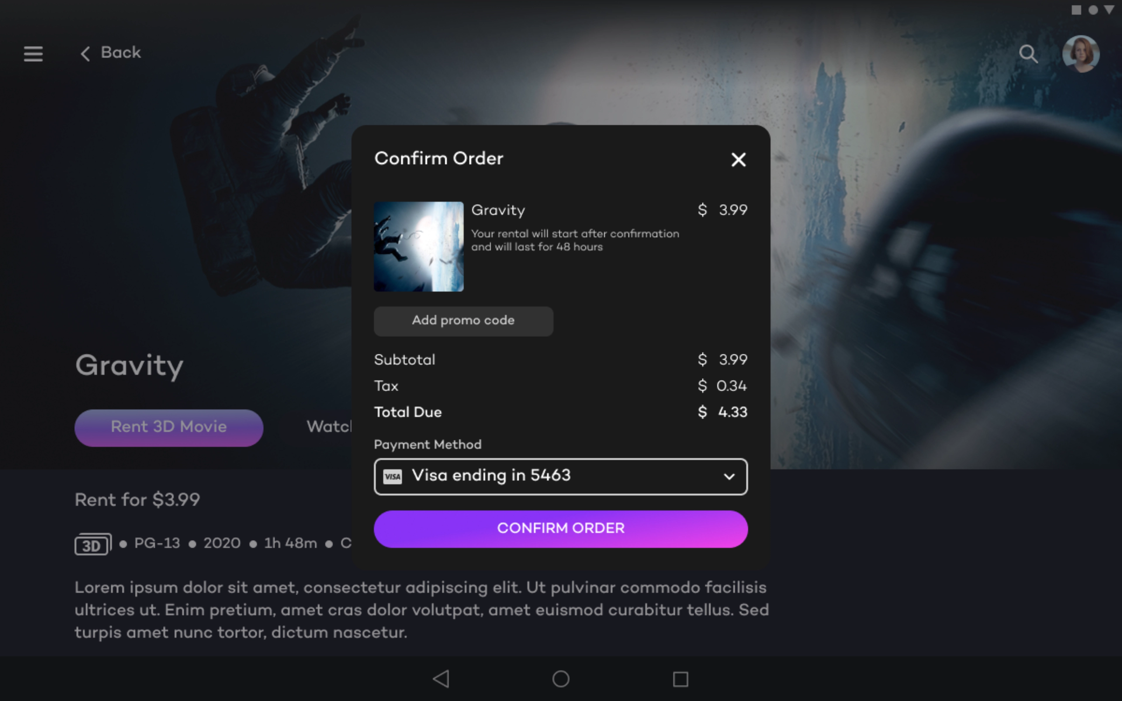
In app checkout rental confirmation modal
I designed the in-app payment flow using Stripe's infrastructure. Users stayed in the app, payment methods saved for future rentals, and the checkout matched the visual language of the rest of the experience. Drop-off went from 74% to 54%.
Outcome
Drop-off at checkout went from 74% to 54% after replacing the browser-based payment flow with native Stripe integration. The free rental credits removed the barrier to first engagement, letting users experience the 3D display before committing to a purchase. The app shipped as a 0-to-1 product for a device category that didn't exist before, built on familiar streaming patterns so the hardware was the only new thing users had to learn.
What worked, what I'd change
The free credits strategy worked because it separated "try the product" from "pay for the product." Users got to experience the 3D display at its best before we asked them for a credit card. Designing the buffering modal as a choice rather than an automatic fallback also paid off. Users stayed in control, which matters when the display technology itself was unfamiliar.
I'd fix the payment flow sooner. We knew the browser checkout was a compromise, but the free credits masked the drop-off until real transactions started. If I'd pushed to instrument the checkout earlier, we could have caught the 74% before it became months of lost conversions. I'd also go deeper on the streaming quality problem from the start. The on-device caching solution that engineering built was the right answer, but we arrived at it reactively after bad test sessions rather than proactively scoping it as a known risk.