Overview
Admins managing 10 to 50+ Autodesk subscriptions had no way to handle renewals efficiently, see spending patterns, or know if they were overpaying. Over the course of a year, I led UX for three connected phases: bulk operations, spending visibility, and AI recommendations. Enterprise admins went from 2 hours of manual renewals to 5 minutes. Renewal completion increased from 67% to 75%, renewal-related support tickets dropped 54%, and billing confusion tickets dropped 35%.
Problem
Admins managing 10 to 50+ Autodesk subscriptions were renewing them one by one. Miss a renewal, and a team loses access mid-project. Support complaints led me to partner with PMs, retention, and the insights team to dig into the root cause.
What we found was structural. Every subscription shows up in the same list as if they're all the same, but under the hood they follow completely different rules: enterprise contracts, regional payment methods like Konbini in Japan, partner-managed licenses. An admin looking at 40 subscriptions had no way to know which could renew together. Beyond renewals, customers had no spending visibility. Users told us the renewal tools were too limited, and that it felt like we were hiding their financial data. And with 100+ products and collection bundles, nobody knew if they had the right mix.
Three layers: operational friction, financial blind spots, optimization guesswork. Each solution created the foundation for the next.
Solution
Filtered complexity so users never see what won't work together
The core challenge was that not all subscriptions can renew together. Enterprise contracts, regional payment methods, partner-managed licenses, different currencies, different billing accounts. Letting users select whatever they wanted and then throwing errors would just create a new kind of frustration.
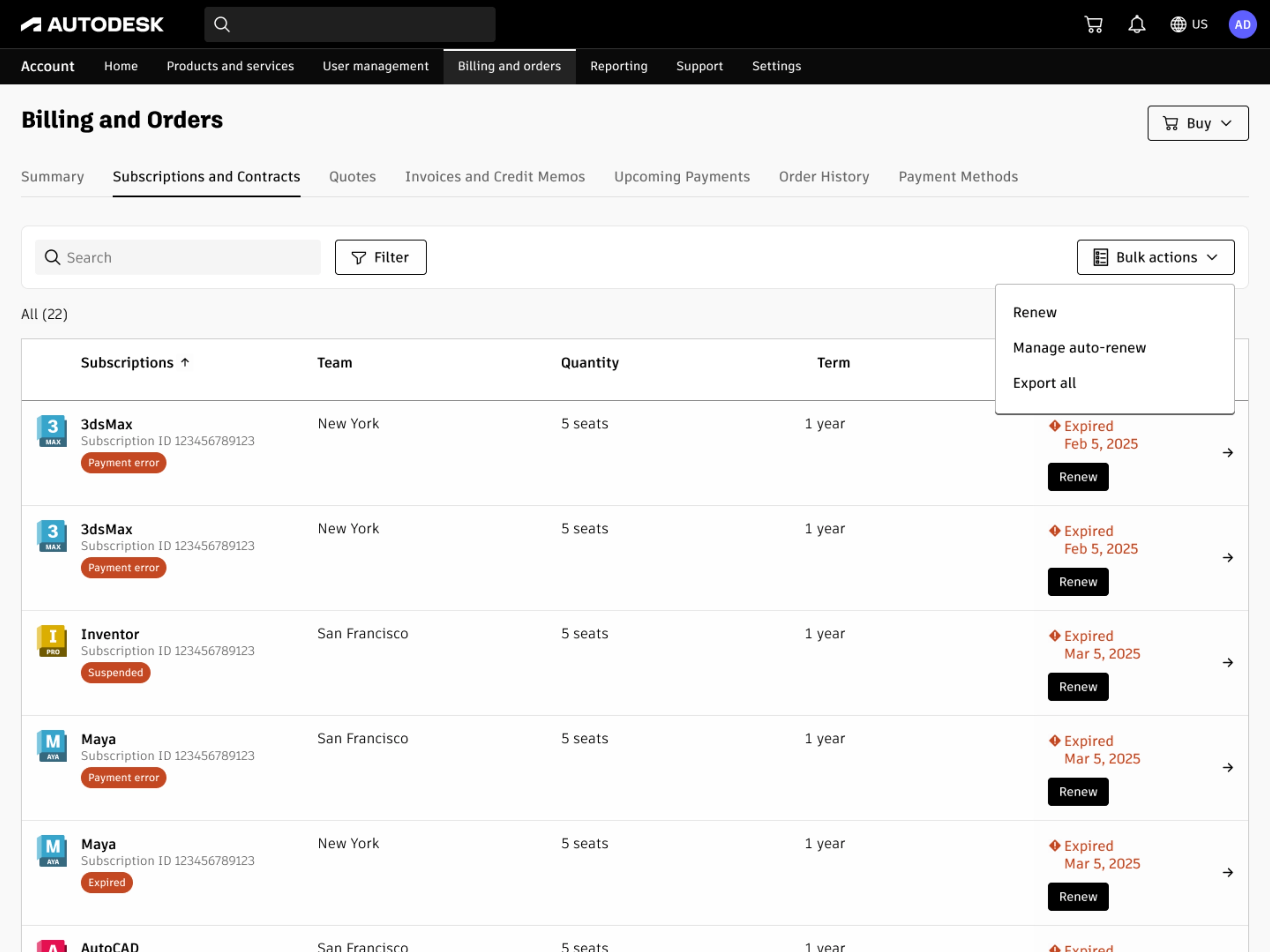
Bulk renew was added alongside individual renewals. Users with multiple subscriptions can now renew them all at once through bulk actions
I designed a progressive filtering system that adapts to account complexity. Simple accounts go straight to an eligible subscription list. Complex accounts with multiple billing accounts or currencies get narrowing steps first. By reducing the set at each step, users never had to understand why certain subscriptions can't combine. The system handled that logic for them.
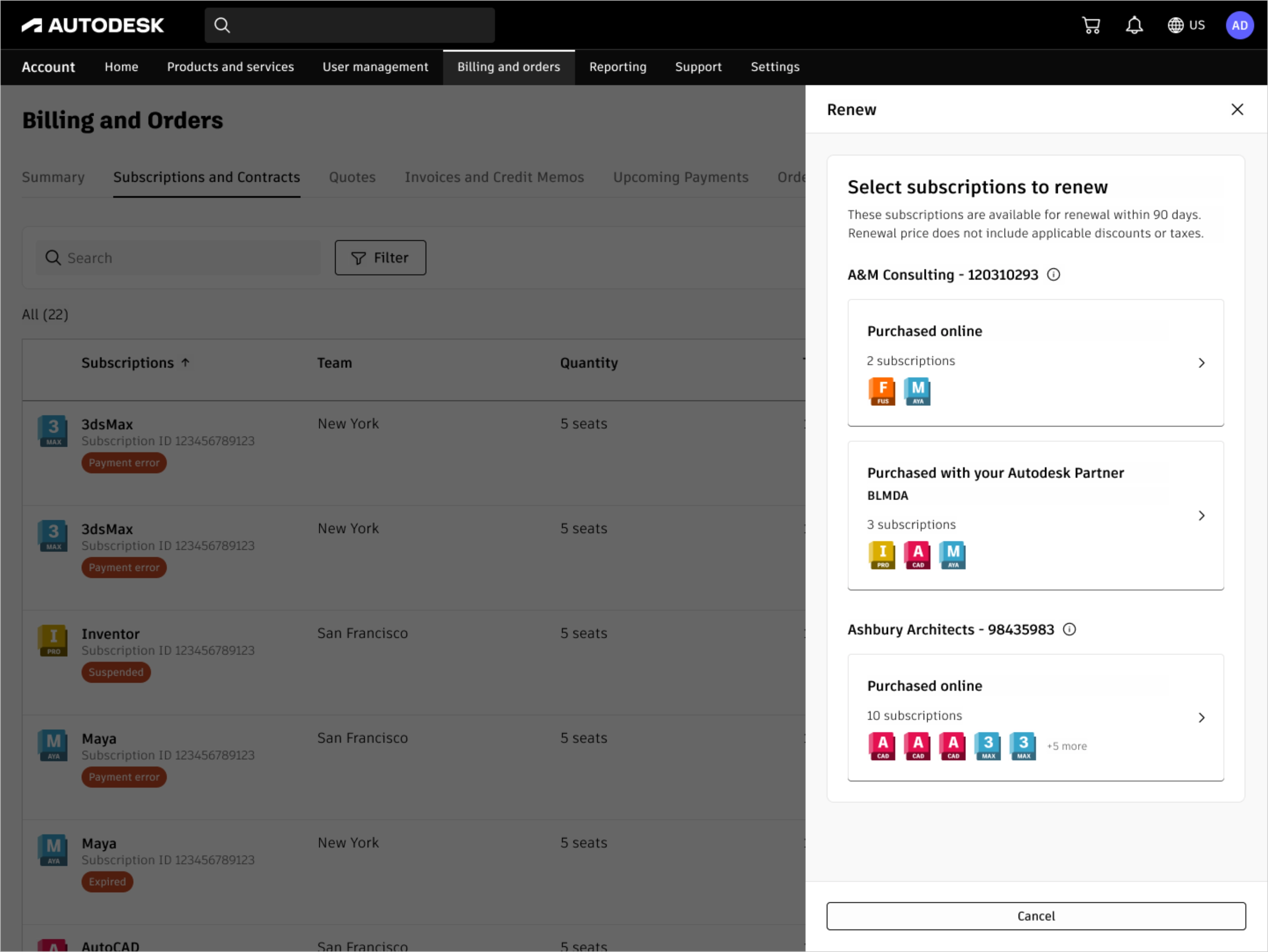
Users narrow by company and sales channel first, so only compatible subscriptions appear in the next step
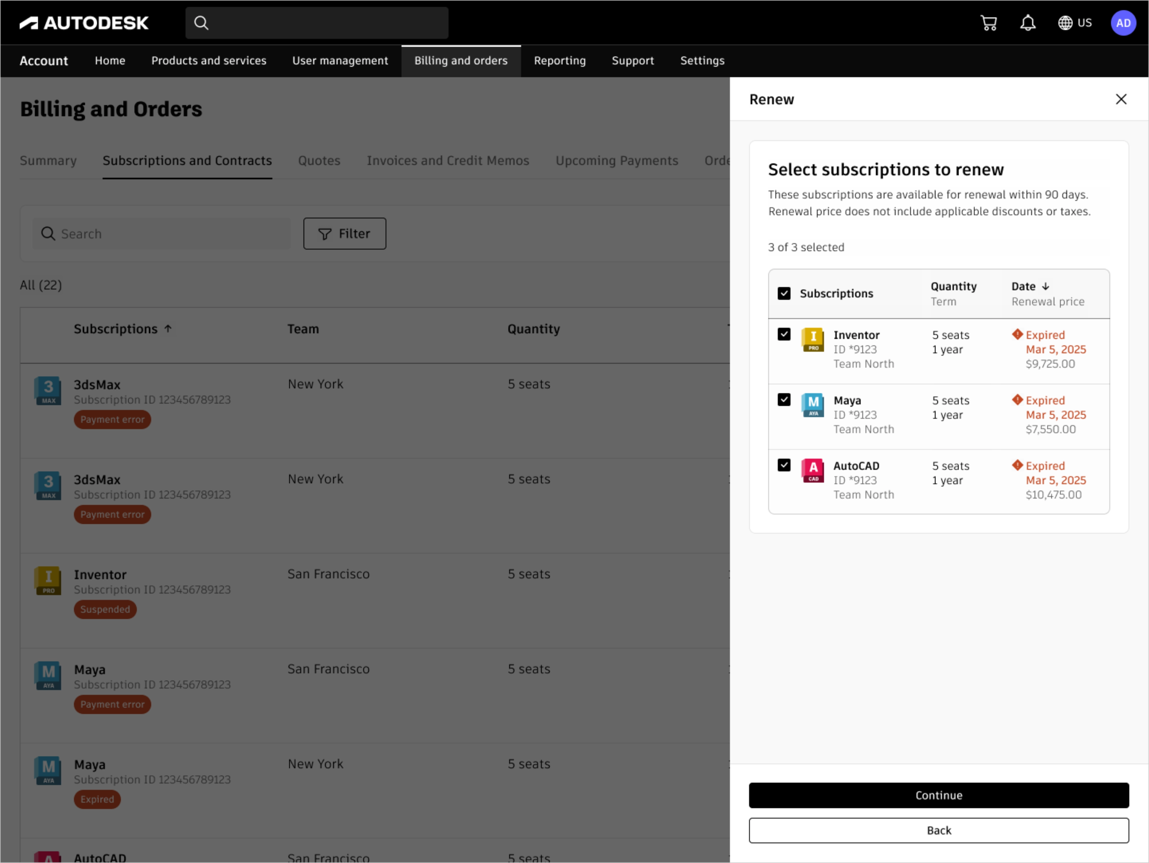
After selecting a company and sales channel, users pick which subscriptions to renew together in one flow
The tradeoff was less user control for better error prevention at scale, which held up well as we expanded to enterprise accounts managing hundreds of seats. This pattern got reused by other teams for different bulk operations. We reduced a 2 hour manual process to 5 minutes for admins with 20 subscriptions, and renewal-related support tickets dropped 54%.
Made the money visible so users stopped feeling in the dark
The bulk renewal service was live, but customers still couldn't see where their money was going, and some felt like we were making it hard on purpose.
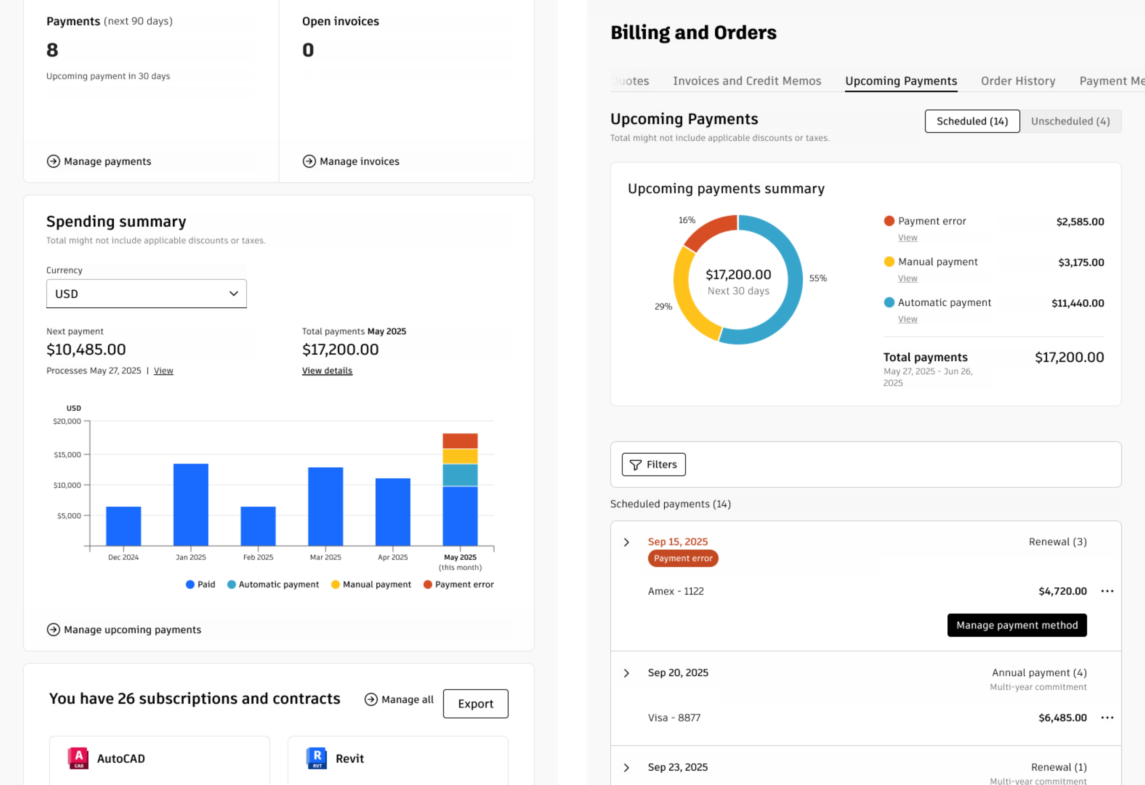
I added spending modules to two pages. On the billing overview, a bar chart shows 6 months of history plus the current month. Each bar breaks down by payment status: blue for paid, light blue for automatic payments like credit card renewals, yellow for manual ones like Konbini where users finish the transaction in a physical store, red for errors or past-due invoices. On the upcoming payments page, a pie chart covers the next 30 days, splitting totals by automatic, manual, and error. Click any category and the table filters to show only those payments. The filters didn't exist before. This let users isolate what needed their attention from what was handling itself.
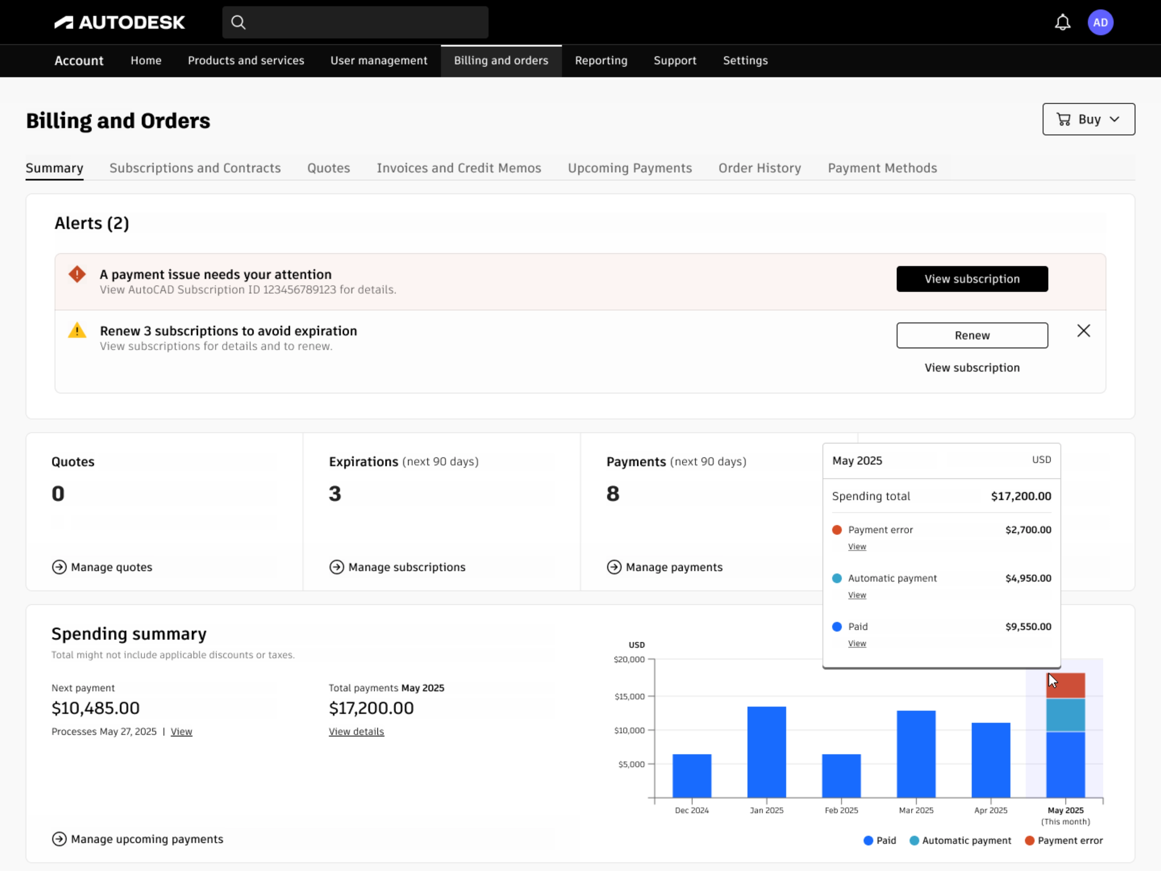
6 months of spending history broken down by paid, automatic, and error so users see the full picture at a glance
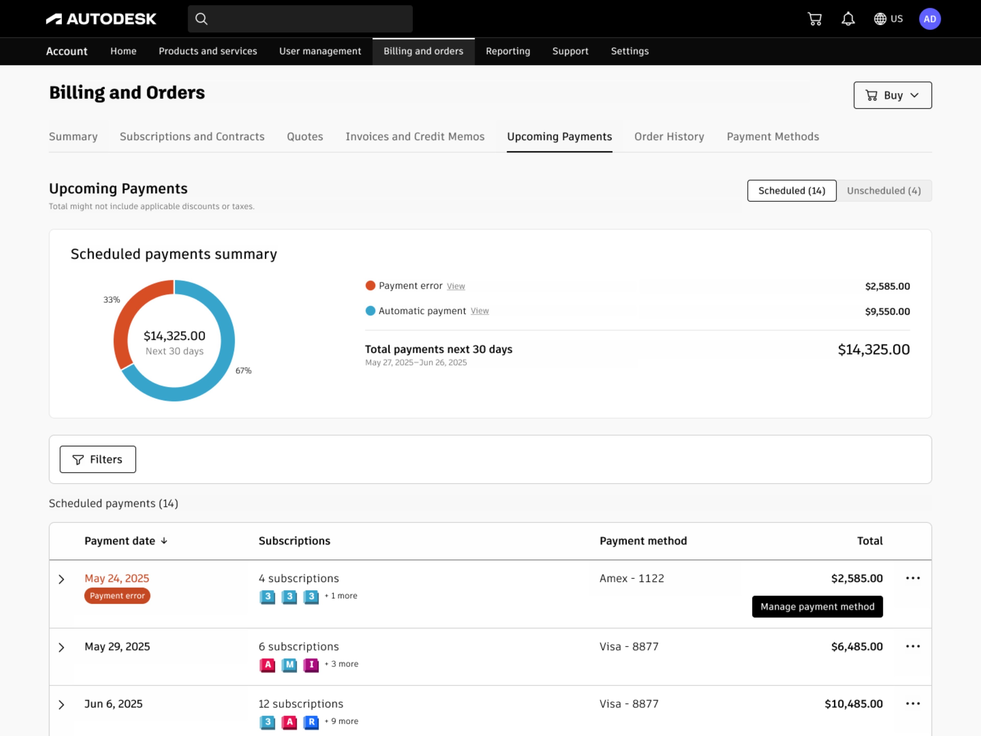
Upcoming payments split by automatic and error. Click any category to filter the table below
Because bulk renewal was already running as a service, users could resolve grouped payment errors or trigger renewals directly from these modules. Red bar in the chart? Click through, fix it. Visibility fed action.
The upcoming payments page itself needed a rebuild. Before, it listed every subscription under a date header at the top with the total at the bottom. If a payment date had 10+ subscriptions, users scrolled up to see the date and back down to see the total. I watched this behavior in FullStory: people bouncing up and down, losing context. I proposed collapsing each payment date into a single line item with the total always visible. Users could expand any row to see individual subscriptions if needed.
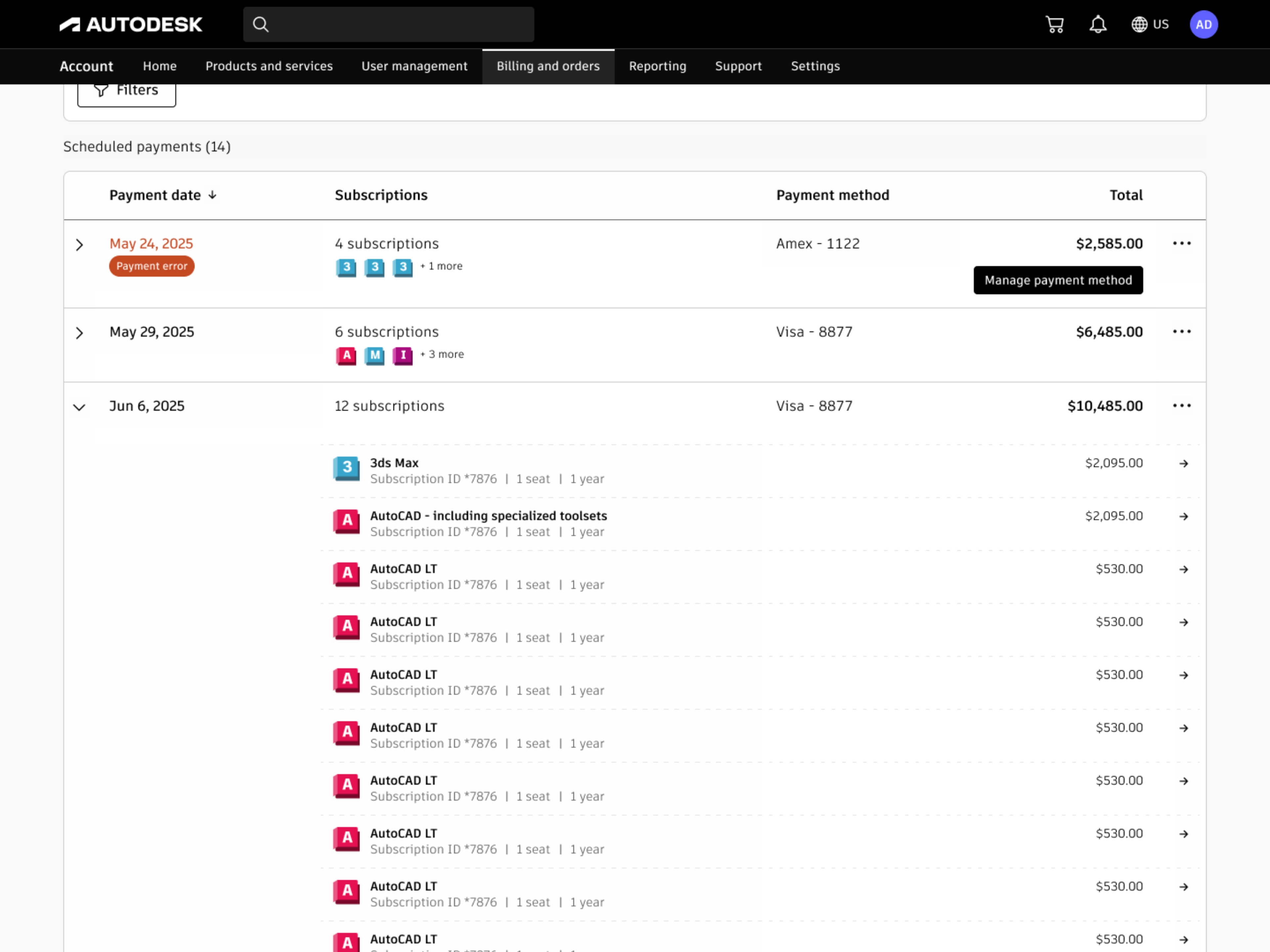
Each payment date collapses into one line. Expand any row to see the individual subscriptions
While mapping every possible payment scenario for this page, I found a gap in the billing system. Multi-year subscriptions (3 year term, paid annually) with auto-renew off weren't showing their annual payments. These aren't optional. The user committed to them when they signed the contract. But the system only surfaced payments tied to auto-renew, so users were getting charged for payments they never saw coming. Support complaints confirmed it wasn't theoretical. I flagged it, and engineering fixed the underlying logic.
Replaced generic product suggestions with data users actually trust
Halfway through the spending work, I noticed the ML team was building a system that could read user subscription data, usage patterns, and spending history. I also found an outdated product recommendation module in the checkout flow. It was rule-based, generic, and had no context about what the user already owned. The opportunity was clear: use the ML infrastructure to deliver personalized recommendations inside the account, not just at checkout.
I worked with the data science and ML teams to define recommendation types, logic rules, and when each one should appear. If someone had AutoCAD and Revit expiring separately, the system could suggest an Architecture collection that costs less than individual renewals. If a user was burning through Flex tokens faster than expected, it could suggest buying more before they run out. Each recommendation shows up only when the data supports it.
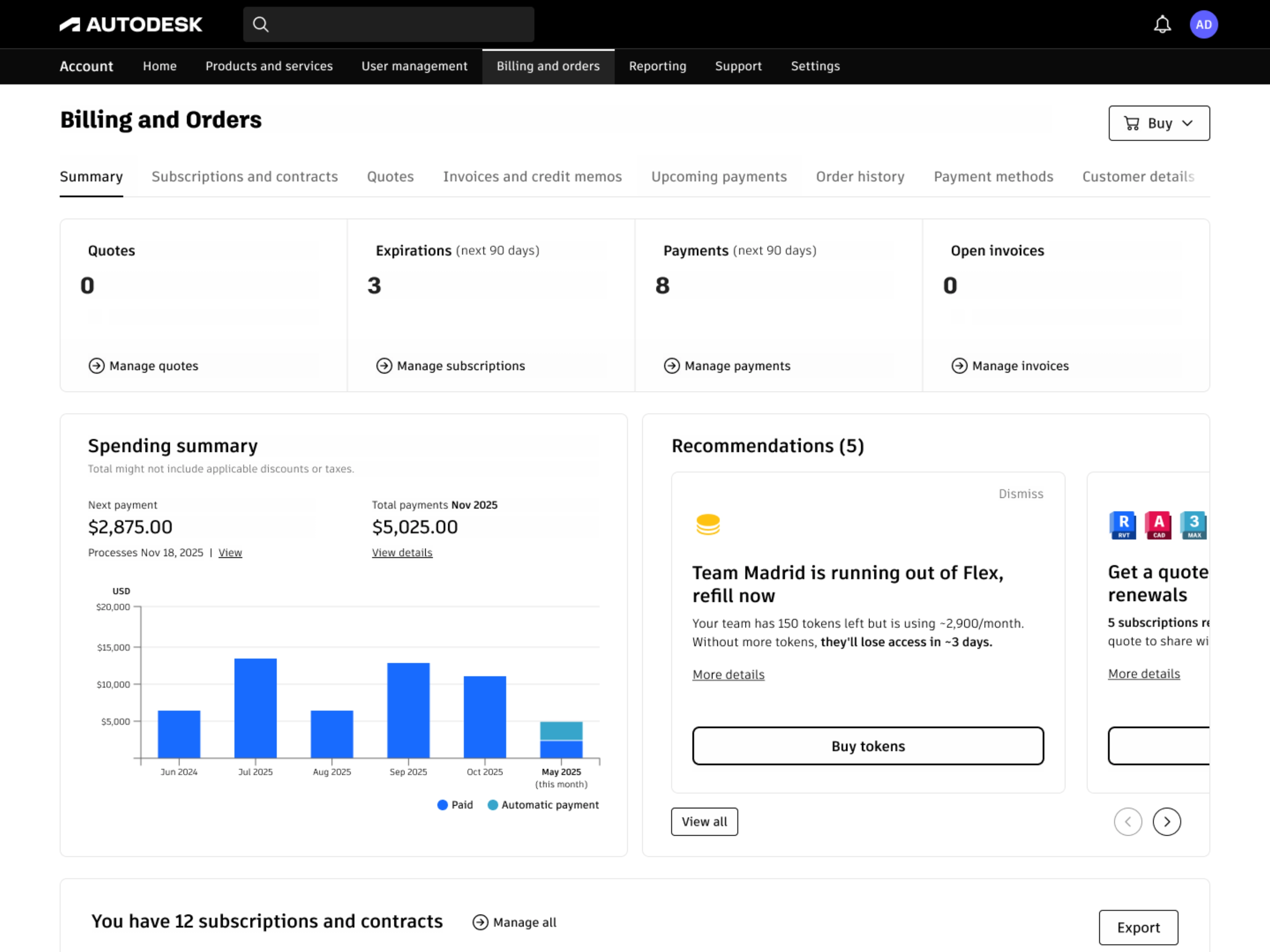
Each card is generated from the user's actual subscription and usage data. Nothing generic
Each card keeps it short: a headline that relates directly to the user's account, a brief description, and two actions. The primary one opens checkout or starts the relevant flow. The secondary one opens a side panel with deeper reasoning like usage data, cost comparisons, and timing context. The AI writes the messaging, which removes the generic copy that made the old checkout module easy to ignore. Every card is dismissible. I built the pattern to work across teams, since the cart team also needed recommendations in checkout but had been using the outdated rule-based module.
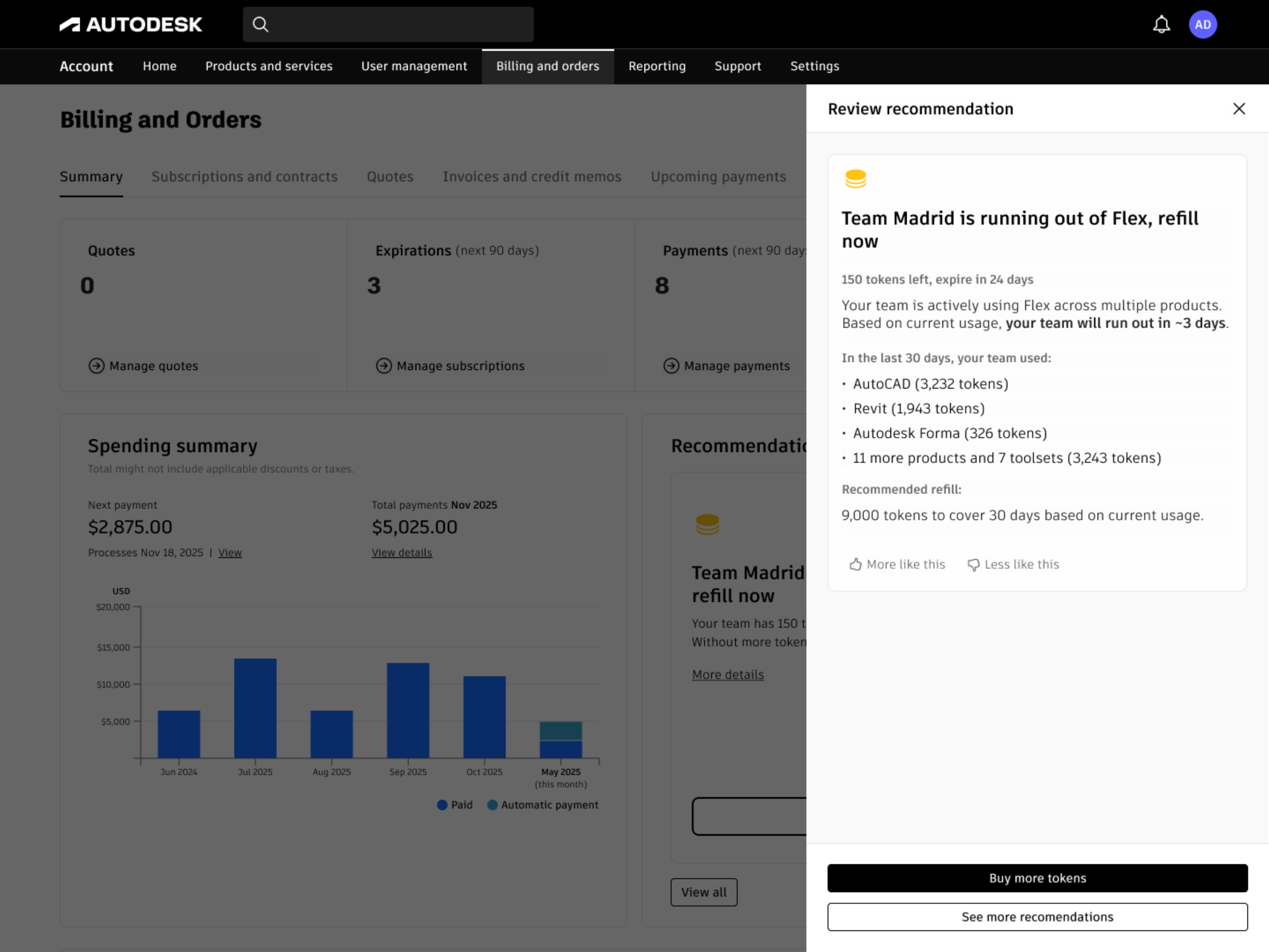
Every recommendation explains its reasoning. Users see the data behind the suggestion and can dismiss if they disagree
We tested different ways to frame recommendations. Leading with cost savings outperformed feature-based messaging. In moderated research sessions, 95% of participants said they trusted the information and 70% found it useful. That trust came from transparency: users could always see why a recommendation was made and dismiss it if they disagreed.
Because bulk renewal and spending data were already in place, recommendations could link directly to action. Suggest a collection? One click opens a pre-filled checkout. That's the payoff of building phases as connected infrastructure.
Outcome
Enterprise admins went from roughly 2 hours of manual renewals to 5 minutes through a single bulk flow. Renewal completion rate increased from 67% to 75%, reducing cancellations that would have forced users to repurchase at potentially higher prices. Renewal-related support tickets dropped 54%. After spending visibility shipped, billing confusion tickets dropped 35%.
The patterns outlasted the features. Progressive filtering, compact payment grouping, and the recommendation card system are all reused by other teams across different parts of the product.
What worked, what I'd change
Building each phase as infrastructure for the next meant nothing was throwaway. The bulk renewal service powered spending management actions. Spending data fed recommendation logic. Progressive disclosure across all three phases created a consistent pattern: simple default, details on demand.
I'd push harder on technical constraints earlier. The spending module shipped with 6 months of history and 30 days of future visibility because the system couldn't reliably surface the next payment for monthly subscriptions. I wanted a full year in both directions, filtering by product, export options, and spending forecasts. The version we shipped was the best the technology allowed, but I could have uncovered those limits sooner and designed around them from the start.
Research was global but not deep enough on regional payment methods. We covered the major markets but issues specific to Konbini, SEPA mandates, and similar local payment flows surfaced later than they should have. For global features, the research needs to go deeper on regional specifics from the beginning.
